heatmap plot
This notebook is designed to demonstrate (and so document) how to use the shap.plots.heatmap function. It uses an XGBoost model trained on the classic UCI adult income dataset (which is a classification task to predict if people made over $50k annually in the 1990s).
[3]:
import xgboost

import shap

# train XGBoost model
X, y = shap.datasets.adult()
model = xgboost.XGBClassifier(n_estimators=100, max_depth=2).fit(X, y)

# compute SHAP values
explainer = shap.Explainer(model, X)
shap_values = explainer(X[:1000])
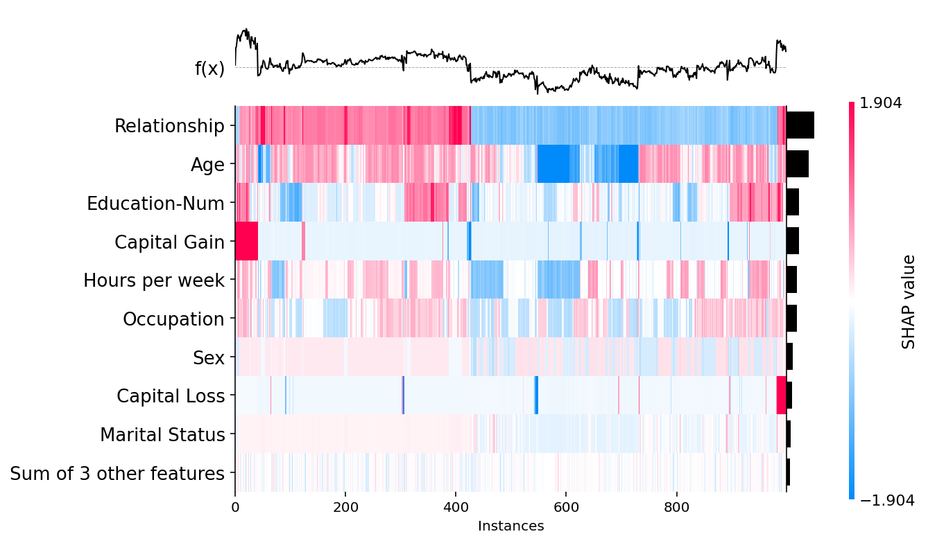
Passing a matrix of SHAP values to the heatmap plot function creates a plot with the instances on the x-axis, the model inputs on the y-axis, and the SHAP values encoded on a color scale. By default the samples are ordered using shap.order.hclust, which orders the samples based on a hierarchical clustering by their explanation similarity. This results in samples that have the same model output for the same reason getting grouped together (such as people with a high impact from capital gain
in the plot below).
The output of the model is shown above the heatmap matrix (centered around the explaination’s .base_value), and the global importance of each model input shown as a bar plot on the right hand side of the plot (by default this is the shap.order.abs.mean measure of overall importance).
[6]:
shap.plots.heatmap(shap_values)

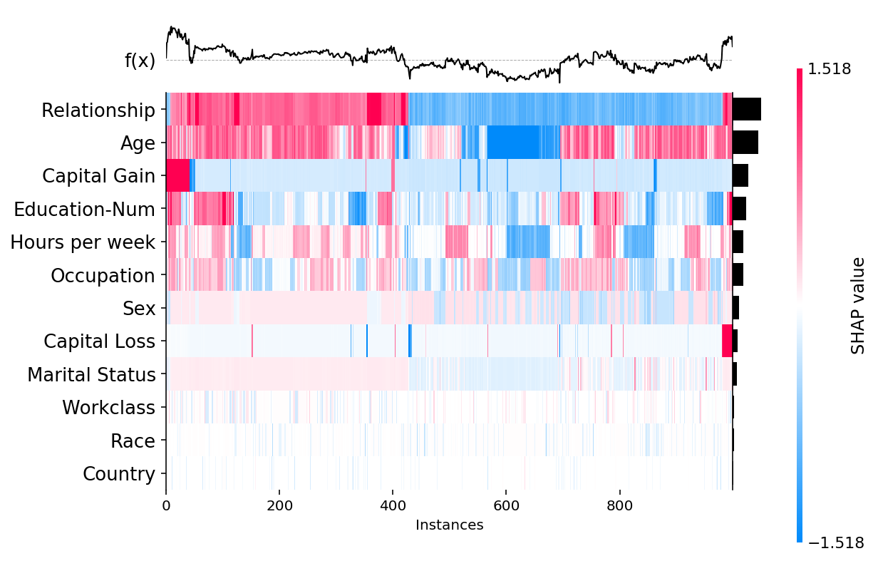
Increasing the max_display parameter allows for more features to be shown:
[3]:
shap.plots.heatmap(shap_values, max_display=12)

Changing sort order and global feature importance values
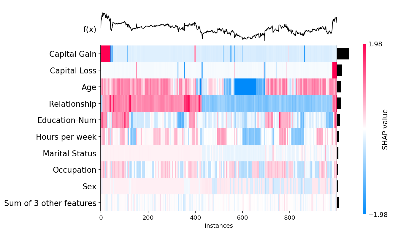
We can change the way the overall importance of features are measured (and so also their sort order) by passing a set of values to the feature_values parameter. By default feature_values=shap.Explanation.abs.mean(0), but below we show how to instead sort by the maximum absolute value of a feature over all the samples:
[4]:
shap.plots.heatmap(shap_values, feature_values=shap_values.abs.max(0))

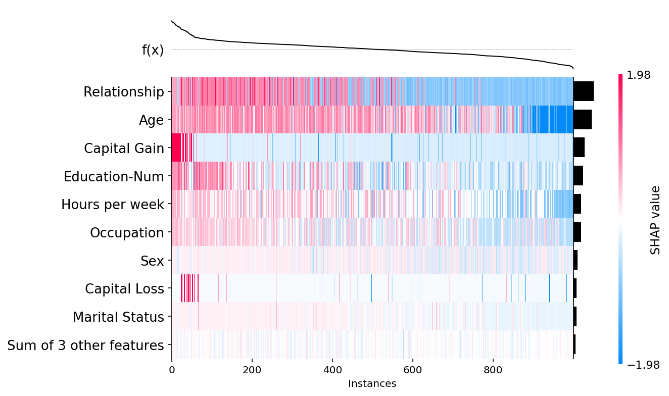
We can also control the ordering of the instances using the instance_order parameter. By default it is set to shap.Explanation.hclust(0) to group samples with similar explantions together. Below we show how sorting by the sum of the SHAP values over all features gives a complementary perspective on the data:
[5]:
shap.plots.heatmap(shap_values, instance_order=shap_values.sum(1))

Have an idea for more helpful examples? Pull requests that add to this documentation notebook are encouraged!