Scatter Density vs. Violin Plot
This notebook gives several examples to compare the dot density vs. violin plot options for summary_plot.
[1]:
import xgboost

import shap

# train xgboost model on diabetes data:
X, y = shap.datasets.diabetes()
bst = xgboost.train({"learning_rate": 0.01}, xgboost.DMatrix(X, label=y), 100)

# explain the model's prediction using SHAP values on the first 1000 training data samples
shap_values = shap.TreeExplainer(bst).shap_values(X)
Layered violin plot
Without color, this plot can simply display the distribution of importance for each variable as a standard violin plot.
[2]:
shap.summary_plot(shap_values[:1000, :], X.iloc[:1000, :], plot_type="layered_violin", color="#cccccc")
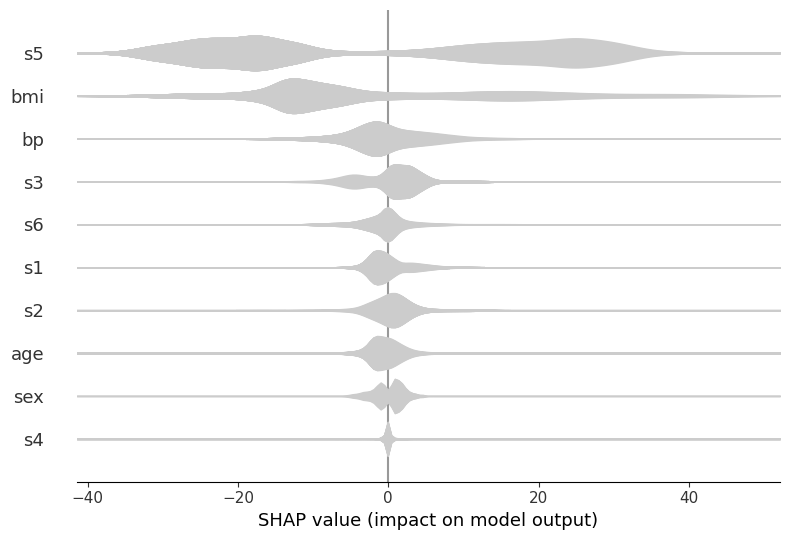
For example, in the above, we can see that s5 is the most important variable, and generally it causes either a large positive or negative change in the prediction. However, is it large values of s5 that cause a positive change and small ones that cause a negative change - or vice versa, or something more complicated? If we use color to represent the largeness/smallness of the feature, then this becomes apparent:
[3]:
shap.summary_plot(
    shap_values[:1000, :],
    X.iloc[:1000, :],
    plot_type="layered_violin",
    color="coolwarm",
)
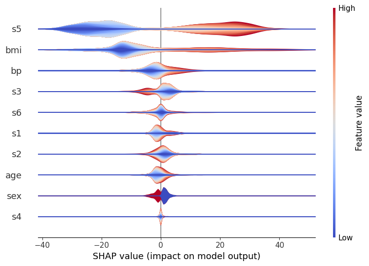
Here, red represents large values of a variable, and blue represents small ones. So, it becomes clear that large values of s5 do indeed increase the prediction, and vice versa. You can also see that others (like s6) are pretty evenly split, which indicates that while overall they’re still important, their interaction is dependent on other variables. (After all, the whole point of a tree model like xgboost is to capture these interactions, so we can’t expect to see everything in a
single dimension!)
Note that the order of the color isn’t important: each violin is actually a number (
layered_violin_max_num_bins) of individual smoothed shapes stacked on top of each other, where each shape corresponds to a certain percentile of the feature (e.g.the 5-10% percentile of s5 values). These are always drawn with small values first (and hence closest to the x-axis) and large values last (hence on the ‘edge’), and that’s why in this case you always see the red on the edge and the blue in the middle. (You could, of course switch this around by using a different color map, but the point is that the order of red inside/outside blue has no inherent meaning.)
There are other options you can play with, if you wish. Most notable is the layered_violin_max_num_bins mentioned above. This has an additional effect that if the feature has less than layered_violin_max_num_bins unique values, then instead of partitioning each section as as a percentile (the 5-10% above), we make each section represent a specific value. For example, since sex has only two values, here blue will mean male (or female?) and read means female (or male?).
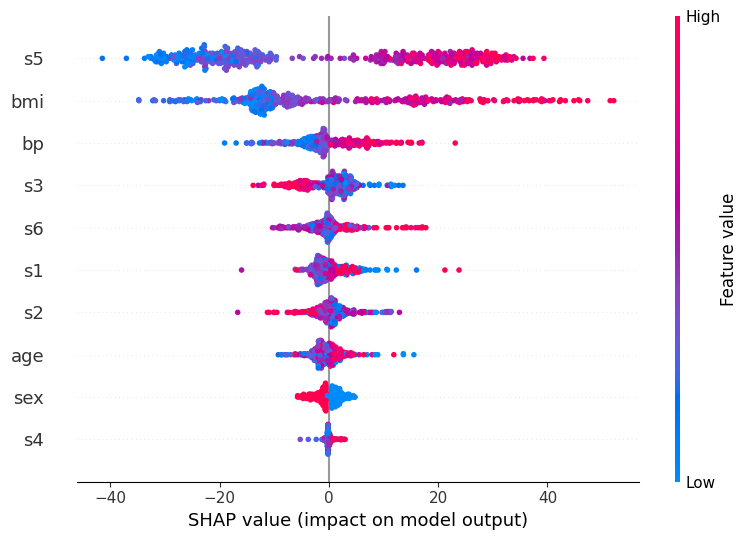
Dot plot
The dot plot combines a scatter plot with density estimation by letting dots pile up when they don’t fit. The advantage of this approach is that it does not hide anything behind kernel smoothing, so you see an exact representation of the data.
[4]:
shap.summary_plot(shap_values[:1000, :], X.iloc[:1000, :])
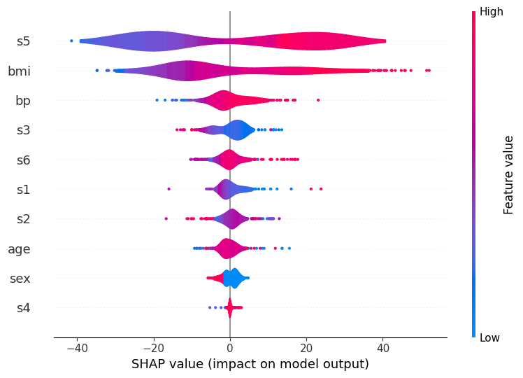
Violin plot
These are a standard violin plot but with outliers drawn as points. This gives a more accurate representation of the density out the outliers than a kernel density estimated from only a few points. The color represents the average feature value at that position, so red regions high feature values dominate while blue regions low feature values dominate.
[5]:
shap.summary_plot(shap_values[:1000, :], X.iloc[:1000, :], plot_type="violin")